
My Projects
Adobe Illustrator


These two vector illustrations were some of the first assignments I had to create. These two were part of an assignment to create a vector character in Adobe Illustrator; we all had to create a bunny as an in-class activity; we were encouraged to be creative; however, we still needed to follow a tutorial. After we learned how to create shapes, paths, and gradients, we were told to create an original character. I decided to make a dinosaur, so I created a Tarbosaurus (Pretty much just a more obscure T-Rex) named Terry. I wanted to make something huggable and squishy-looking; I think I accomplished that with his multiple chins and little teeth. He was made with the pen tool; I used a Freeform gradient for the sun on his back. The trees are symbols you can find in Illustrator; the ground and river were just made using the Pen tool, and the sky is a large rectangle with a gradient.
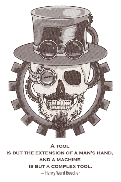
This steampunk-inspired design was for a vector illustration class. I was tasked with creating something combining something natural with something mechanical. I also had to include a fitting quote with an attribution.
I decided to create a skull wearing a tophat with goggles; I gave it a robotic eye made of a pressure gauge, I gave the skull a mustache and stubble, and finally, I framed the design with different-sized gears.
This design started as an illustration in Photoshop. I then image-traced it, posterized it, and created a pattern with squiggly lines of different thicknesses. I assigned the heaviest pattern to the darkest areas, and so on and so forth up to the lightest.
Below you will find mockups for this design, showcasing how it might look on different products.


For this assignment, I was tasked with vectorizing a raster image. I was provided this image of Osmosis Jones; I mostly used the Pen tool to create all the shapes, and I used gradients to shade and color the shapes. It's not perfect, but it is pretty good.


Original
My vectorized version

Here is an animal Infographic I was tasked with creating. I had to use Adobe Illustrator to create an infographic that you might see in a zoo, specifically attached to an animal's enclosure. We also had to use the graph tool at some point in the design. I used it to measure out the heights of all the animals in the diet section of the design.
I wanted to use the Dire wolf as my animal, as I had heard it had been cloned. This infographic used information available in the fall of 2025, so some of it may be outdated by now.
Here is both the finished version, and some consept are I created at the beginning of the project.


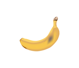


And finally, my final assignment for this course was to create and furnish a room using Illustrator's Perspective Grid tool. I used Illustrator's 3D tools to turn a path I drew with the Pen tool into a wine bottle, and I did the same with the bowl. I also created this apple and banana using the Pen and Mesh tools. I pretty much just used the Rectangle tool to make all the objects in the scene. I used the Flare tool to create the lens flare seen over the fire. I put an opaque black rectangle over the entire image and used the Shape Builder tool to cut out sections to appear as shadows being cast. I created the rug in a different Illustrator project, exported it, and placed it on the floor using the Perspective Grid tool.


These two were part of an assignment to create a vector character in Adobe Illustrator; we all had to create a clownfish by following a tutorial and any sea creature we wanted. After we learned how to create a fish in Illustrator, it was time to create our own sea creature. I decided to make a Bullshark named Bruce; creative, I know. I made Bruce's body and fins using the Pen tool; I used the Freeform gradient to shat his body as well as applying Freeform gradients to his fins. I manipulated a circle to create his eye and applied a Freeform gradient to add some shine. I used the Pen tool to make his white belly. I applied a Freeform gradient to shade his belly; looking back, I wish to extend the white of his belly past his body, and used the Pathfinder or Shape Builder to cut away the exes, scenes I didn't know about either of those tools at the time, I instead tried to carefully follow the curve of his belly with the Pen tool. After that, I used the Grain Effect to give his skin a rougher appearance. I used the Pen tool to create the curve of his mouth and, you guessed it, applied a Freeform gradient to shade his mouth. I used a normal gradient and the Paintbrush tool set to charcoal for the water in the background. Finally, for the rocks and seaweed, I used the Pen tool with three different shades of grey to make the rocks, and I used the Pen tool set to charcoal and Width Profile 1 to taper the ends.

For this assignment, we were tasked to create an image out of words; we could make anything as long as we built it with text. I typed out Hiccup's opening speech from the first How to Train Your Dragon book. I then cut, placed, and colored all the words so they were in the shape of Toothless from the How to Train Your Dragon movies. I typed out the word Cloud and scaled each letter so it resembled a cloud; I spread a few of them around the image and finished it up with a gradient for the sky and ocean.


The images below are from an assignment where we were tasked with creating a repeating pattern in Adobe Illustrator; we had to create a simple and complex pattern, and we also had to make four additional recolors of the pattern using Adobe Color and Illustrator's Recolor Artwork feature. I decided to make the complex pattern into gift wrapping; I made a cute snowman design with snowflakes and trees. I set it as a swatch and was able to get it to repeat. I also decided to make the simple pattern into gift wrapping. The first snowman recolor was in an autumn scheme; the second one is a more purple version of the first. It's not much of a difference, but it gives it a different feel. The third one is more of a greyscale winter; it looks less happy and fun, but it is more realistic. And finally, I thought cyan and dark red would look nice together, and it does.
For the dinosaurs, I recolored the first one to purple and green, and I wanted it to look like Barny, and now it does. The second one I recolored is similar to the first one, but the dinosaurs are blue; it's not a huge change, but it's a nice one. The third one is pink and yellow; I was just spinning the recolor wheel around, and I liked the way the yellow dinosaurs looked, so it's pink and yellow. And finally, the last one is dark red and light blue; I liked how well the red and blue snowman turned out, so I tried it out on the dinosaurs, and I like this even better; the desaturated light blue looks nice next to the dark red.