
Photoshop
These images consist of edited photos, mostly from college assignments.
Image Restoration

Before

After
These restoration jobs were done in Photoshop and for an assignment. I mostly used the spot healing brush, clone stamp tool, and content-aware fill, and for the recolored photo, I also used the brush tool on layers set to color as their blend mode. The only things I wish I had done differently for the recolored photo would be leveling it out, as it is at an angle, and I wish I had given them a more desaturated yellow for their hair. I restored these photos a while ago and can't remember where I found them.

Before

After
Designing a Magazine Cover
This was for an assignment; the goal was to look at a magazine cover and make our own version. I wish I had put a little more effort into mine. Looking back, I can see a few spelling errors, and the text in the bottom left is hard to read. But overall, I think it looks ok, and the jokes I spread around the design are a little funny.


Collage and Composition
This collage was for an assignment; I had to make or find assets and put them together into an overall design. We were given the Polaroid photos and told to replace the picture. Besides the Polaroid frames, I created all these assets by taking photos of various dog-related items around my house. I made the dog hair seen around the collage by petting my dogs to get some of their hair, then I put the hair on a black piece of paper, took a picture, took the picture into Photoshop, and created a custom brush; this allowed me to place hair around the collage as needed. I think the collage looks good overall.
Photoshop Effects and Filters
There are various Photoshop projects that I created; the dog poster was for an assignment where we learned how to create duotones; it was pretty fun, and I enjoyed making a poster for a fictional puppy camping service. The Assassin's Creed soundtrack covers were also for an assignment; we were tasked with creating an album cover in Photoshop. I made two versions; the first one aims to capture the more historical aspects of the Assassin's Creed series, and the other aims to capture the more fantastical elements by evoking the Eagle vision from versus entries in the series. This last one is a YouTube thumbnail I created; it was inspired by a YouTuber named Max0r and a video he released about the thumbnail of the 2013 game Metal Gear Rising: Revengeance.

Duotone:
This was for an assignment; we had to show that we knew how to use gradient maps to create a duotone. I created a poster for a fictional puppy camping service; I used a photo I had taken of my dog sleeping on a backpack. I thought it was cute, and I had the photo on hand, so I picked some cute colors I thought would go together nicely and used a gradient map to reassign the lighter shades to light blue and the darker shades to pink.


Album cover:
I created this more historical-looking one by first finding the necessary stock photos on Pixabay. I was looking for people in hoods because white hoods are an iconic part of the franchise, and I wanted to add them. I also wanted to add an old map to the background of the design. I also wanted an old sailship for the front of the cover because I felt it fit the third Assassin's Creed game. I created both versions by combining posterization, gradient maps, and crosshatching filters.
For the second Egle vision version, I used a color layer to darken the background and turn it blue; I then painted on some streaks coming off of the two hooded men. I used a Path Blur to make the streaks look more like wisps of smoke, I used another color layer to turn the two men red, and used the Dodge tool to add an internal glow effect to make it appear as if they are glowing from within; adding all these effects to the second version made the cover look a lot more like Egle vision from the Assassin's Creed games. I may be wrong, but I believe the barcode is from the physical version of the third Assassin's Creed; I remember wanting to add an ester egg like that, but I don't remember if the barcode is just a random one or specifically the game's barcode.
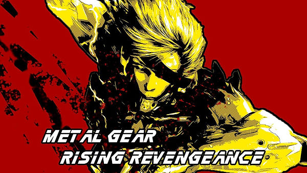
YouTube thumbnail:
This was created for a YouTube video I posted; I wanted a cool thumbnail with simple colors and an almost comic book design. I created this thumbnail by taking a piece of promotional material for the game Metal Gear Rising: Revengeance; I then removed the character from the background and replaced it with a solid color. I then used a combination of posterization, gradient maps, and halftones. I then added a stroke to the character to better separate him from the background; I then added a slashing effect behind him by painting a few rough strokes and using a hard eraser to add more movement to the thumbnail.
Posters
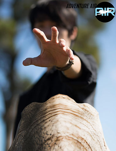


These posters were made for an assignment and were made as advertising for a fictional travel agency that takes people to a resort inspired by Jurassic Park. I was allowed to come up with my own ideas as to what the advertisement would be about. I chose a travel agency because we would also have to create a logo and app icon for future assignments, and we would also have to create a website mockup for another assignment, so I decided to make all of these various projects about a fictional travel agency I created. These posters were made using stock photos from Pixabay, except the first poster with the man reaching out to touch the dinosaur; it was still made with stock photos, but the dinosaur was a free 3D model from Turbosquid. I placed the dinosaur into Autodesk's 3DS Max, rendered a few different angles for its head, and touched them up in Photoshop to match the lighting better. As for the pterosaurs in the third poster, I found a stock photo on Pixabay and used the dodge tool in Photoshop to lighten the inside of their wings to make them appear as if light was shining through them.